Iframe—Use card and page elements
The Clover iframe (inline frame) provides access to card and page elements. On the merchant's payment page, you can:
- Add a Clover iframe as a single-page component with all of the required fields or
- Integrate each page element individually, if required, for the design of your app.
Before you begin
- Complete the steps set up a payment form.
- Create an interactive payment form where you can create instances of iframe card elements and insert (mount) them in
<div>containers. - See how to customize iframe elements with CSS.
Use card elements
The Clover iframe SDK includes seven card elements that you can combine and use as required fields in your application. All elements are auto-validating.
For each element, you can optionally set custom styling as a second parameter.
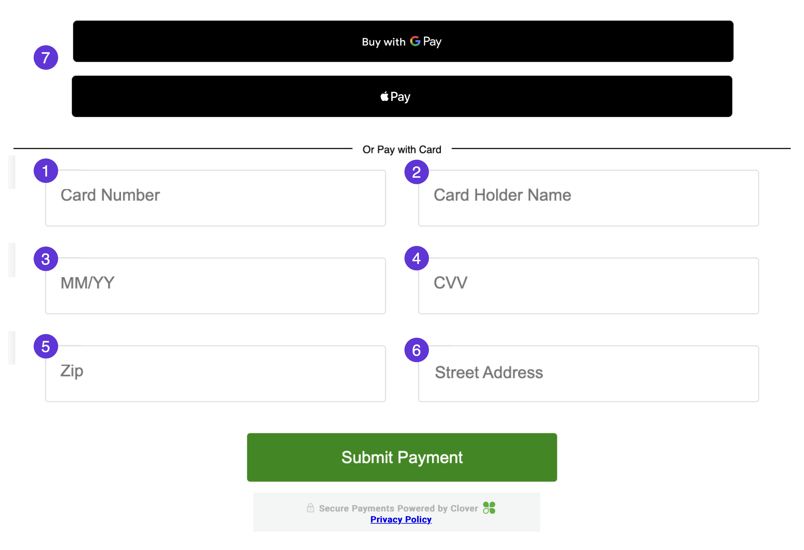
Card elements on the Clover iframe
1. cardNumber
Use the cardNumber element to accept a credit card number.
const card = elements.create('CARD_NUMBER', styles);2. cardHolderName
Use the cardHolderName element to accept a credit cardholder's name.
const card = elements.create('CARD_NAME', styles);3. cardDate
Use the cardDate element to accept a credit card's expiration date. Supports both MM/YY and MM/YYYY formats.
const cardDate = elements.create('CARD_DATE', styles);4. cardCvv
Use the cardCvv element to accept a card verification number.
const cardCvv = elements.create('CARD_CVV', styles);5. cardPostalCode
Use the cardPostalCode element to accept a cardholder's postal code.
const cardPostalCode = elements.create('CARD_POSTAL_CODE', styles);6. cardStreetAddress
Use the cardStreetAddress element to accept a cardholder's street address. This information is used for all Address Verification Service (AVS) fraud rules.
Note: You must pass the merchantId parameter when configuring the Clover SDK to use the street address field. If the merchantId is not accessible and the merchant has enabled the address verification services (AVS) fraud rules, the payment from a tokenized card fails with an AVS error at the time of charge or order pay. Use Ecommerce test cards for AVS success scenarios.
const cardPostalCode = elements.create('CARD_POSTAL_CODE', styles);

const clover = new Clover('12a3b45167a89123d4567989123e45f67', {
    merchantId: 'xxxxxxxxxxxxx'
});
const elements = clover.elements();
7. paymentRequestButton
Use the paymentRequestButton element to add one of the following buttons to request payments for transactions:
Use page elements
The Clover Privacy Policy is automatically added to the footer of every iframe using a <div> container with the clover-footer class.

Secure Payments Powered by Clover - Privacy Policy
Related topics
Updated 28 days ago